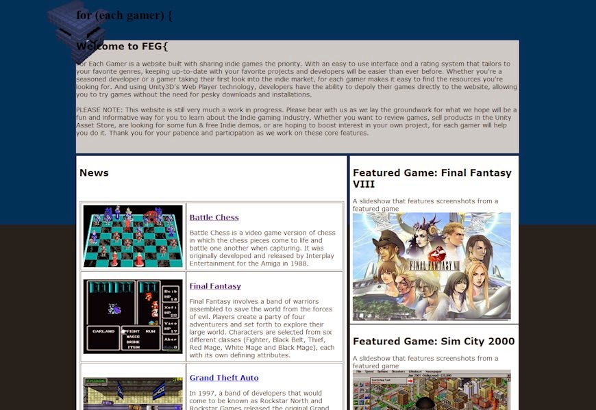
The layout for the index page will look pretty much the same, but the content will be layed out a bit different. I'm compressing the layout by one column, and adding panels that expand/contract from the right and left sides. I'm doing a terrible job explaining this with words, so we'll go with a screen of my concept:
The new login/registration panel
The above screenshot shows the panel I was trying to describe. There will be a welcome message to new visitors at the top, followed by an expanded login sub-panel. The registration and "Add A Game" panels can be expanded by clicking the appropriate header, and the login panel will collapse when needed.
When you click to preview one of the games/demos/articles/etc., the entire right panel will hide, and a panel on the left with more details will open up. Closing this left panel will re-open the right panel automatically, eliminating the need to adjust the content in the center. Since only one panel will ever be open, and one will always be open, the "content" in the center of the screen will only shift position to the left and right, but will never need it's layout updated.
Concept work for the upcoming 'content preview panel'
I intend to use this system for my search page as well. I've come to the realization that the search system in this website needs to be absolutely top-notch, since chances are it will be the resource most used by members. Granted, browsing through the featured section is nice, but when I'm ready to search for a game, I want to put in what I'm looking for and get easy to navigate results.
The updated search system, however, is for a future blog post. As are all the other ideas I've added to my To-Do list. Needless to say, jQuery will be changing this site drastically, but it will be a much easier to use website in the end.


